Grid-06

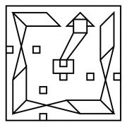
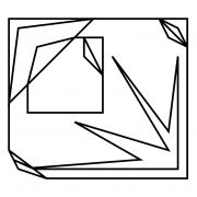
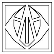
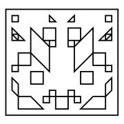
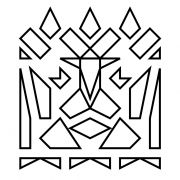
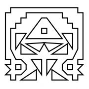
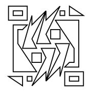
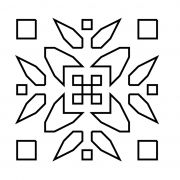
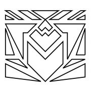
Grid-6 uses a larger variety of shapes than any of the gridz before it. Its elements are mostly spread out in a reflecting manner over the y axis, with one minor exception: the borders.
Let’s start this with simple words: the main shape looks like the next-generation batman sign (unintentionally, but welcomely), mysterious, aggressive, dangerous, and wanting to fly up into the sky. This piece strives towards symmetric perfection but fails. But does it do it purposefully? There are a few details that may suggest so. The irregular triangular shapes on the upper-left and lower-right corners are one of the few elements that are not reflected over the y axis, but they are reflected diagonally instead. The same applies to the smaller triangles pointing to the other corners, but these triangles maintain their normal shape. The two square-shaped borders that follow inward also display similar diagonal misbalances. The second border has cut-off corners over one diagonal axis, and a squares aligned to the corners across the other diagonal axis. Finally, the third and smallest border inverts the positioning of the cut-off corners.
There is plenty more material to analyze here because this is the most complex grid in the gridz series so far, which also leads opens more doors for subjectivity. But why hold back from subjectivity when it can create a meaningful connection between you and art? Here I see an aggressive emblem, validated and certified by seemingly logical arrangements, yet communicating its imperfect human nature subtly. A perfect faction emblem?
Introducing Gridz
Gridz are abstract art pieces with the following characteristics:
- Have a minimalist design
- Are drawn using a grid as aguide (usually from 8x8 up to 20x20)
- Use only staringht lines that start and end at grid crossings
- Use repetition and space creatively and thoughtfully
- May implement familiar/thought-provoking shapes and symbols
-
Do not use suggestive titles
I created gridz sometime around November 8, 2013, which is Hermann Rorschach's birthday. Rorschach was a psychologist that developed the famous "inkblots test" as a psychoanalysis method. The idea of something so seemingly-simple as an inkblot provoking such deep-rooted thoughts to surface fascinated me.
Another concept behind gridz is Piet Mondrian’s style of abstraction (i.e. Broadway Boogie-Woogie). Mondrian abstracted or “simplified” his compositions to the extent of reducing elements to vertical and horizontal lines and primary colors. Similarly, gridz are highly abstracted and limited which makes creating them a straight-forward and relatively simple process (like inkblots!). Ironically, this abstraction and simplicity are what allow gridz to serve as windows to deeper and more complex ideas. In other words, gridz speak directly and clearly, with minimal interference so that the minds of both creators and viewers can take the spotlight.
Gridz share many similarities with mandalas: spiritual and ritual symbols used in Hinduism and Buddhism for meditation and trance induction. Mandalas are generally square-shaped and use symmetry, repetition, radial balance, and many other elements that are also common in gridz. These stylistic elements in combination with a variety of shapes can make gridz highly meditative, taking both the creator and viewer on a journey of self-discovery through association. This process of meditation and discovery is very personal and can differ greatly between viewer and creator.
Other styles of art using similar elements to gridz are:
Regarding the use of descriptive/creative gridz titles: Initially, before completing the 30 Gridz Series, I had envisioned eliminating the use of creative/descriptive names for gridz and adding this restriction to the list of characteristics listed above. The intention behind this restriciton was to extend the minimalist nature of gridz and prevent any additional influence that the title may cause on the observer. For instance, if I called a grid "Bird", the viewer would immediatly think of a bird before even experiencing the piece. Instead, for the 30 Gridz Series I used a sequence of title names in the follwoing format: "Grid-XX". After completing the 30 Gridz Series and experimentally tagging them with descriptive names, I noticed the pieces were instantly more popular--people liked being guided by the title. I decided to make the use of suggestive titles optional, but in its purest form girdz will have non-descriptive titles.
tags:
visual, gallery, art, design, gridz




Add new comment