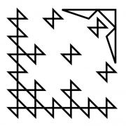
Grid-27
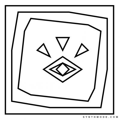
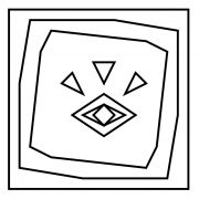
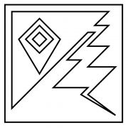
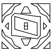
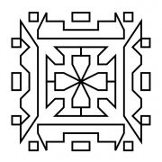
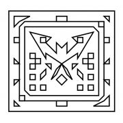
Grid-27 was aimed at combining perception and reality in a similar way as Grid-15 but in a more direct and stripped-down fashion. The tunnel-like borders encapsulate the main subject (an eye symbolizing perception) in layers similar to those found in video feedback loop effects (also known as Optical feedback). The three triangles pointing towards the eye symbolize stimuli being taken in by the senses.
I find optical feedback fascinating because I see it as a simplified version of the human mind and one of the many analogies of how it may work. This analogy consists of the mind as a very complex feedback-loop system. This system intakes stimuli from all available sources (such as the senses) and starts a process that yields a modified output, which is sometimes extremely different from the raw input. This output can be so strikingly different that it will often create the illusion that content and actions are being spontaneously brought forth by an individual (and his "self") alone (suggesting that ideas are created rather than just remixed/processed). For instance, when recording a blank screen and feedback-looping it, simple tilts in camera angles can result in complex visual dynamic patterns developing. These patterns can trigger image recognition systems in the human mind leading to phenomena such as paraidolia (as discussed in Grid-14). Suddenly you are no longer looking at a blank screen: you are now looking at a face, or a flower, or a hurricane.
What about our creative decisions and "our own input"? The optical feedback analogy is over-simplified because we are not simply tilting camera angles when we make decisions, but aren't there numerous conscious (and unconscious) influences that affect our decision making process? Perhaps too many to fully account for--very likely so. In the end, how much are we really truly deciding? It may not be as much as we thought, and we may actually be more like feedback machines :|
But don't be discouraged by this idea! As disenchanting as it may sound, the idea of our minds being feedback-loops systems can actually serve for improving one's self: breaking cognitive-emotional feedback loops. After all, if you are truly creative you can hack any feedback-loop system to add your own flavor ;P ...and while you're at it check out MilkDrop, my favorite visualizer of all time, which is mostly just an optical feedback system on steroids.

Introducing Gridz
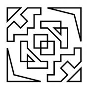
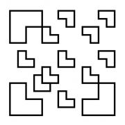
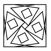
Gridz are abstract art pieces with the following characteristics:
- Have a minimalist design
- Are drawn using a grid as aguide (usually from 8x8 up to 20x20)
- Use only staringht lines that start and end at grid crossings
- Use repetition and space creatively and thoughtfully
- May implement familiar/thought-provoking shapes and symbols
-
Do not use suggestive titles









Comments
Thanks for every other
you're welcome!
you're welcome!
Add new comment