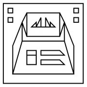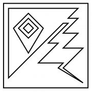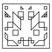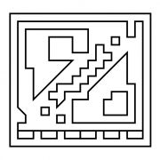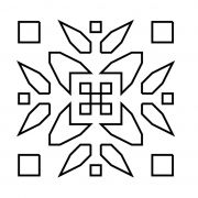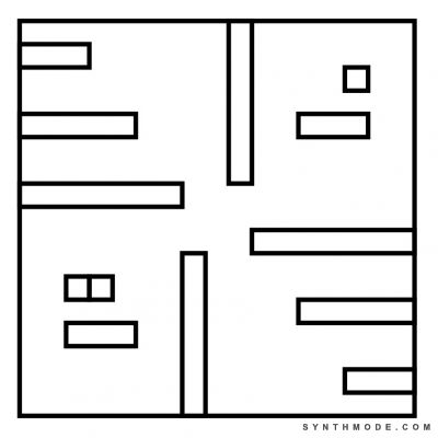
Grid-28

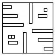
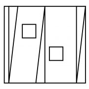
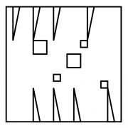
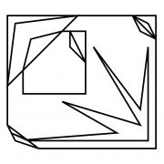
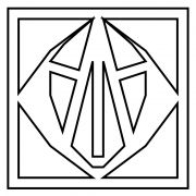
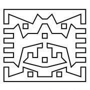
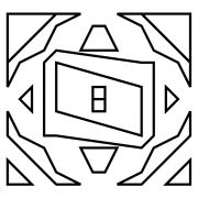
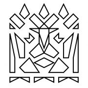
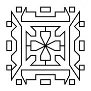
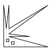
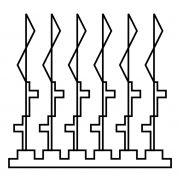
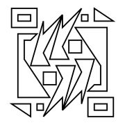
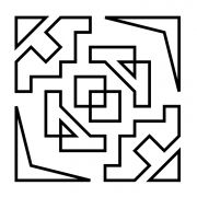
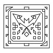
Grid-28 was inspired by the Aztec number system and time.  The composition is generally divided into four quadrants and the dividing strips meet towards the middle in a swirl-like arrangement that suggest cock-wise rotation--all of these details are similar to those of a clock. The 2nd and 4th quadrants are filled with horizontal strips that gradually become shorter as they approach the corners, suggesting a gradual progression such as that of a timer.  The rest of the quadrants contain rectangles and squares arranged in a similar fashion to the Aztec number system.  The 1st quadrant has the lesser value, while the 3rd quadrant has a greater value--suggesting incremental growth.

One difference between the Aztec number system and what is seen here is that there is only enough horizontal space for 3 squares to fit over one rectangle.  In the Aztec number system there is space for 4 circles above a bar, which means that instead of adding at 5th circle, a bar is drawn.  The number system shown in Grid-28 allows for a maximum of 3 squares on top of a bar, which means that each bar is equal to 4 units.  This detail illustrates the difference between the decimal system and how we measure time (60 seconds in one minute, 60 minutes in one hour, 24 hours in one day, etc.).  This clock does not measure time in an exact Aztec number system in the same way that our clocks are not decimal.


Add new comment

CAPTCHA
This question is for testing whether or not you are a human visitor and to prevent automated spam submissions.

Introducing Gridz

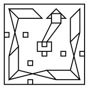
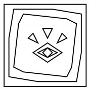
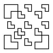
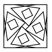
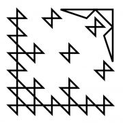
Gridz are abstract art pieces with the following characteristics:

  • Have a minimalist design
  • Are drawn using a grid as aguide (usually from 8x8 up to 20x20)
  • Use only staringht lines that start and end at grid crossings
  • Use repetition and space creatively and thoughtfully
  • May implement familiar/thought-provoking shapes and symbols
  • Do not use suggestive titles
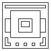
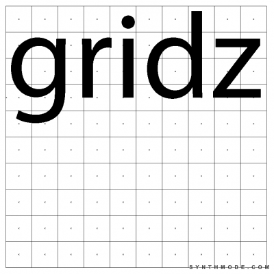
I created gridz sometime around November 8, 2013, which is Hermann Rorschach's birthday.  Rorschach was a psychologist that developed the famous "inkblots test" as a psychoanalysis method.  The idea of something so seemingly-simple as an inkblot provoking such deep-rooted thoughts to surface fascinated me.
 
Another concept behind gridz is Piet Mondrian’s style of abstraction (i.e. Broadway Boogie-Woogie).  Mondrian abstracted or “simplified” his compositions to the extent of reducing elements to vertical and horizontal lines and primary colors.  Similarly, gridz are highly abstracted and limited which makes creating them a straight-forward and relatively simple process (like inkblots!).   Ironically, this abstraction and simplicity are what allow gridz to serve as windows to deeper and more complex ideas.  In other words, gridz speak directly and clearly, with minimal interference so that the minds of both creators and viewers can take the spotlight.
 
Gridz share many similarities with mandalas: spiritual and ritual symbols used in Hinduism and Buddhism for meditation and trance induction.  Mandalas are generally square-shaped and use symmetry, repetition, radial balance, and many other elements that are also common in gridz.  These stylistic elements in combination with a variety of shapes can make gridz highly meditative, taking both the creator and viewer on a journey of self-discovery through association.  This process of meditation and discovery is very personal and can differ greatly between viewer and creator.
 
Other styles of art using similar elements to gridz are:
 
Regarding the use of descriptive/creative gridz titles: Initially, before completing the 30 Gridz Series, I had envisioned eliminating the use of creative/descriptive names for gridz and adding this restriction to the list of characteristics listed above.  The intention behind this restriciton was to extend the minimalist nature of gridz and prevent any additional influence that the title may cause on the observer.  For instance, if I called a grid "Bird", the viewer would immediatly think of a bird before even experiencing the piece.  Instead, for the 30 Gridz Series I used a sequence of title names in the follwoing format: "Grid-XX".  After completing the 30 Gridz Series and experimentally tagging them with descriptive names, I noticed the pieces were instantly more popular--people liked being guided by the title.  I decided to make the use of suggestive titles optional, but in its purest form girdz will have non-descriptive titles.
tags: 
visual, gallery, art, design, gridz